[ CASE STUDY ]Skills Fix
Aligning brand and user experience to support business evolution
Skills Fix is a specialist training provider, originally focused on the construction sector, but expanding into broader areas of training and consultancy.
As the business evolved, so did its ambition.
The challenge was ensuring the brand and website kept pace.
The issue wasn’t the direction of the business. It was how clearly that direction was being communicated.
The situation
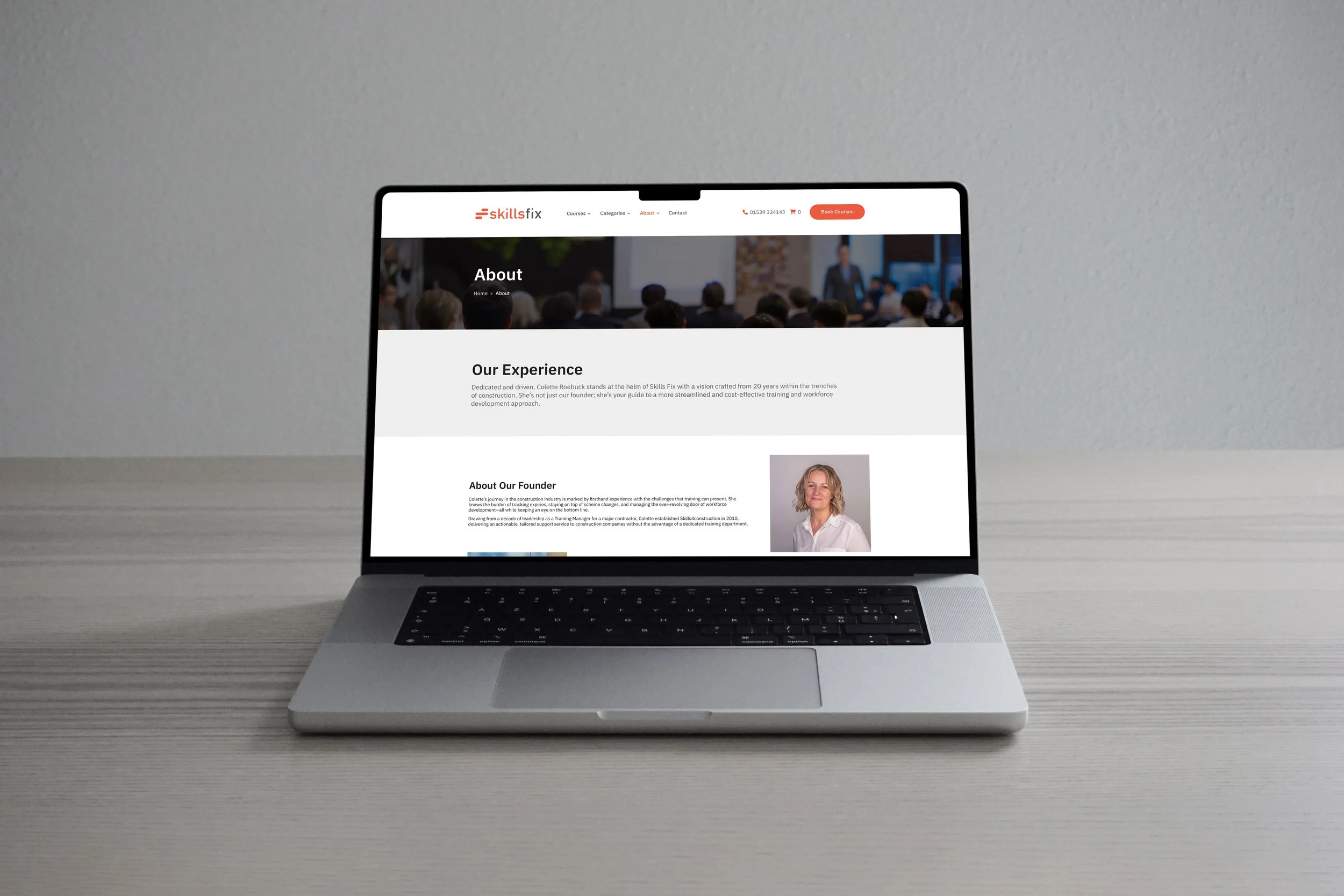
Skills Fix had already invested in developing a new website, but there was a concern that it did not fully reflect the brand or support the next stage of growth.
The business was moving beyond its original focus, but the website risked anchoring it to the past.
This created a gap between:
where the business was heading
and how it was being presented
Left unaddressed, this would limit its ability to:
appeal to new sectors
communicate a broader offer
convert interest into bookings
The shift in approach
Rather than starting again, we worked with what was already in progress and focused on improving how the site functioned and communicated.
The aim was to align:
brand
structure
user experience
So the website would actively support the business, not restrict it.
This meant:
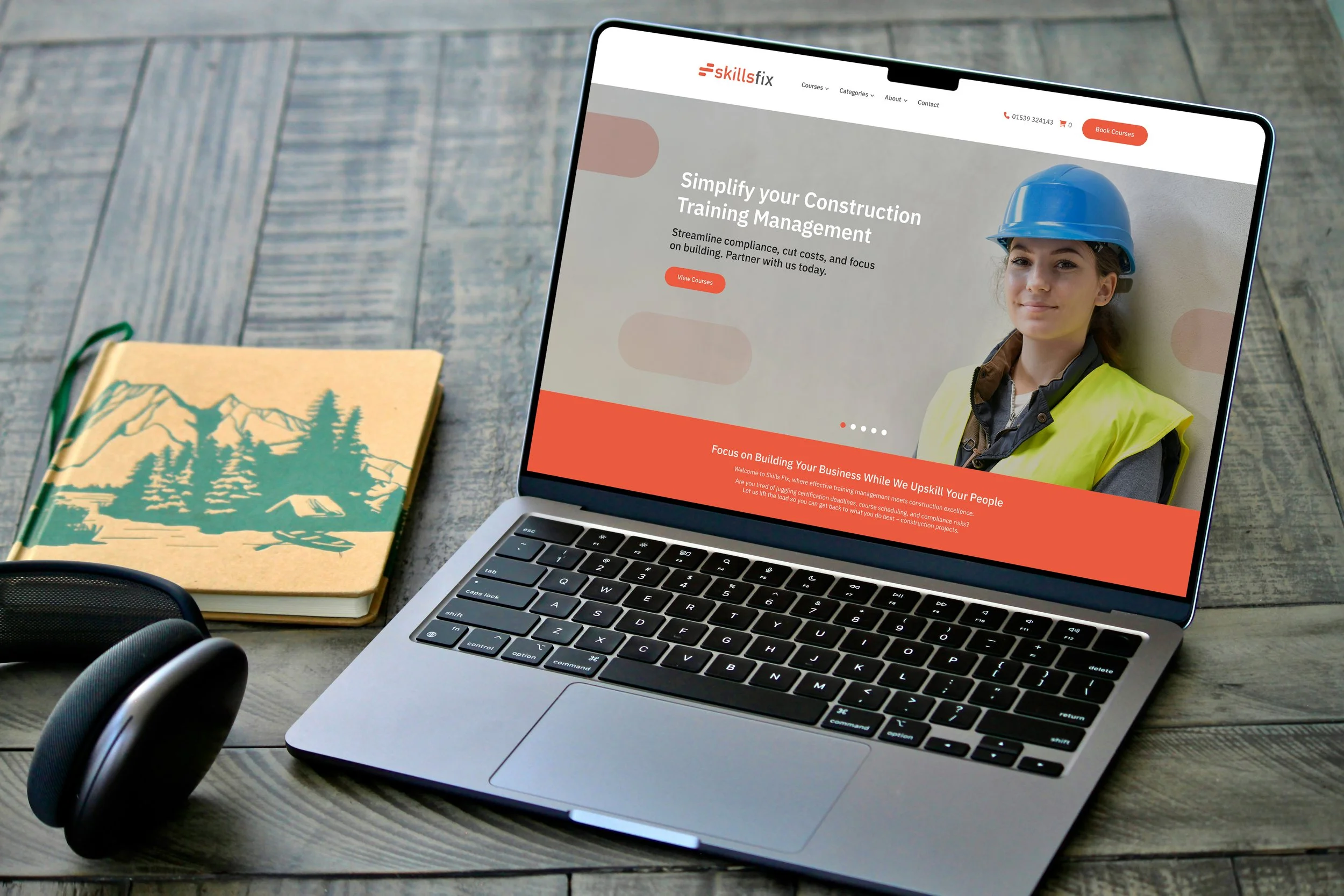
refining the visual presentation to better reflect the brand
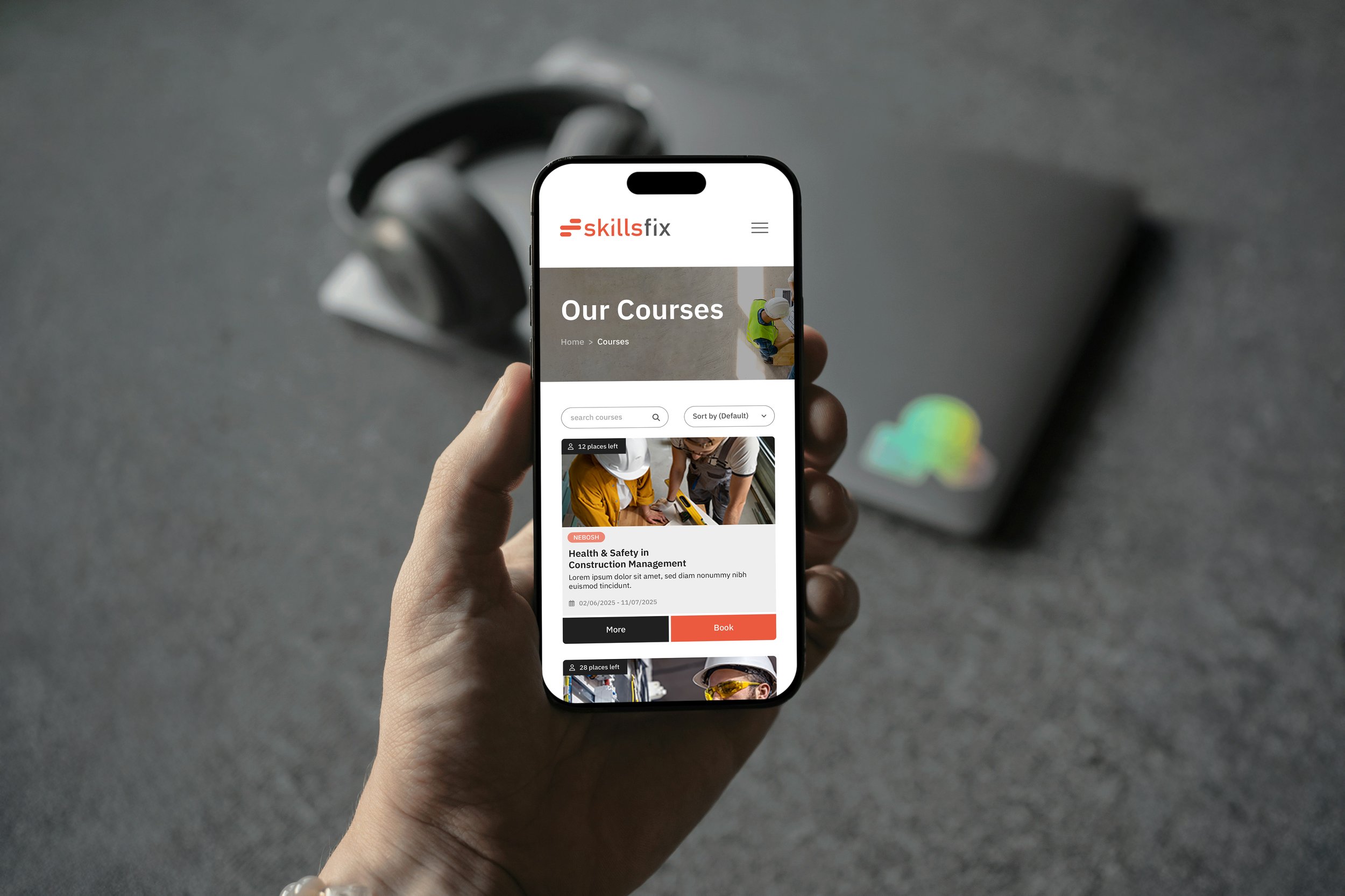
restructuring the site around how users search for and book training
improving navigation to make it easier to find relevant courses
introducing areas to support future marketing activity
The focus was on clarity, usability and growth.
What we delivered
A full review of the development version of the website
Improved layout, structure and navigation based on user journeys
Enhanced visual design aligned with the brand
Strategic input into key sections, including featured courses and marketing areas
Close collaboration with the developer to ensure a cohesive outcome
This ensured the final site worked both visually and commercially.
The impact
With a clearer structure and stronger alignment between brand and user experience, the website became a more effective tool for the business.
Improved usability and navigation
Stronger alignment with the evolving brand
Increased ability to support course bookings and future campaigns
More importantly:
The website now reflects where the business is going, not where it has been.
It provides a platform that supports expansion, rather than limiting it.
Client perspective
“Bespoke Brands brought a fresh perspective, smart structure and creative thinking… they managed the project so I could stay focused on running my business.
Their support saved me time and delivered a far better result than I could have achieved alone.”